


Overview
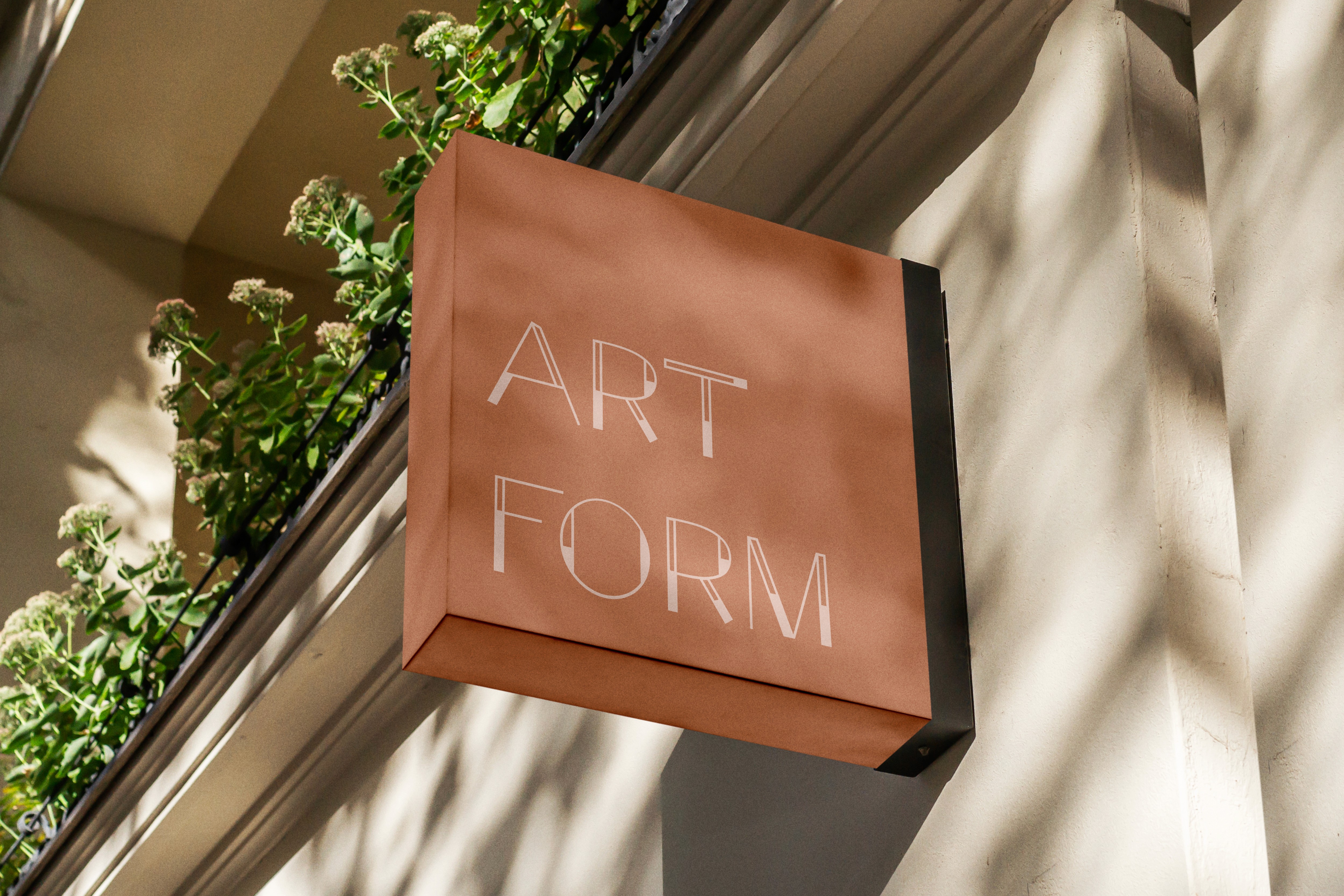
During a course, covering typography and layout, I had the opportunity to create a typeface from scratch. I've found through my exploration of typefaces that I really enjoy geometric fonts. I enjoy how clean and open they are. I wanted to incorporate this into the typeface I chose to create. Through an exploration of geometric art I decided to use the De Stijl movement as a guide post for how I created this typeface; especially the work of Piet Mondrian. Ultimately, I gave my finalized typeface the name "Pietmetric" to marry these two inspirations together.
Process
I started this process by brainstorming the style of typeface I wanted to create, as well as how I could make what I created unique and inspired within the style I was interested in. Once I had an idea of a my direction I started the research process. I spent time collecting examples of geometric typefaces that I found inspiring. I also researched geometric art styles and movements that I could take inspiration from. I curated a mood board from this research and wrote up some thoughts and ideas of what I wanted to elicit in the final typeface. Next I created sketches of the letter "H" to narrow down how I wanted to begin. Once I narrowed down a direction I extrapolated on that direction with more "H" sketches. Next I created "HocNavPub" sketches and once I selected a direction to continue with I refined those sketches to utilize in Illustrator. I continued the process of creating each letter with the back bone of the aspects created in the "HocNavPub" forms. Finalizing each letter was not only an individual process but also a wholistic one. It was important to consistently zoom out to see how the collection of letters felt together.
Insights
I appreciated the importance of zooming in and out that this project instilled in my process. Type is detailed even in it's simplest forms, and those details are what help it feel polished, but because it is a collection there is a constant need to zoom out and insure there is a cohesiveness to the collection. This project gave me a deeper love and understanding of typography and its importance, art, and value in design. It also reminded me of how much I love getting into the tiny details of design, and what a big impact those details can have on the overall project.